
In the world of apparel, screen printing has long been a popular method for adding designs to garments. From custom t-shirts to hi vis workwear, screen printing offers a versatile and durable way to showcase creativity. However, one aspect that often gets overlooked is the role of colour theory in screen printing. Understanding how different colours interact and influence each other can significantly impact the final result of a print job.
Why Colour Matters
Colour is an essential consideration in t-shirt printing. It can convey emotions, evoke responses, and even affect how the design is perceived. Different colours have different meanings and can create varying moods. For example, red is often associated with energy and passion, while blue conveys calmness and trust. By leveraging colour theory in screen printing, businesses can create designs that effectively communicate their message.
The Basics of Colour Theory
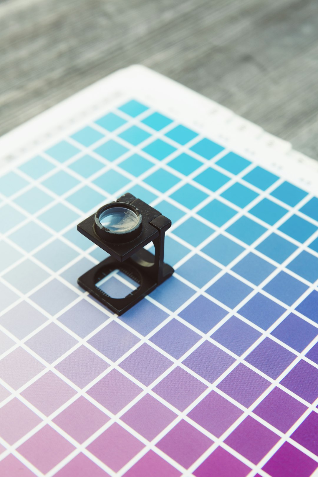
Colour theory is a set of principles that govern how colours interact with each other. The three primary colours – red, blue, and yellow – are the building blocks of all other colours. By mixing these primary colours, secondary colours such as green, orange, and purple are formed. Understanding the colour wheel and how colours relate to each other is crucial in creating visually appealing designs in screen printing.
Complementary and Analogous Colour Schemes
In apparel screen printing, two common colour schemes are complementary and analogous. Complementary colours are opposite each other on the colour wheel, such as red and green, while analogous colours sit next to each other, like blue and purple. Using these colour schemes in t-shirt printing can create visually striking designs that catch the eye.
Creating Contrast and Harmony
Contrast and harmony are essential elements in any design, including screen printing. Contrast can be achieved by using colours that are opposite on the colour wheel, making elements stand out. On the other hand, harmony is created by using colours that are similar in hue, creating a cohesive and unified look. Balancing contrast and harmony is key to producing impactful t-shirt designs.
Psychology of Colour in Uniforms Printing
When it comes to printing hi vis workwear, the psychology of colour plays a significant role. Bright, eye-catching colours like yellow and orange are often used in high visibility garments to make the wearer more noticeable. Understanding how different colours can impact visibility and safety is crucial for businesses in industries where hi vis workwear is necessary.
Using Colour in Digital T-Shirt Printing
In the digital age, technology has transformed the landscape of t-shirt printing. Digital t-shirt printing allows for more intricate designs and vibrant colours to be reproduced accurately on garments. By leveraging the capabilities of digital printing, businesses can explore a wide range of colours and effects to create unique and personalised t-shirt designs.
Colour Trends in Apparel Printing
Like any other industry, the world of apparel printing is influenced by colour trends. Each year, new colour palettes and combinations emerge as popular choices for t-shirt designs. By staying informed about current colour trends, businesses can design prints that resonate with their target audience and reflect the latest fashion sensibilities.
The Impact of Colour Vibrancy
The vibrancy of colours can significantly impact the final outcome of a screen printing job. Bright and bold colours can grab attention and make a design stand out, while muted tones can create a more subdued and sophisticated look. Understanding how colour vibrancy affects the overall aesthetic of a print is crucial in achieving the desired outcome.
Colour Considerations for Branding
For businesses looking to create custom uniforms or branded apparel, colour choice is a crucial aspect of branding. Colours can convey the values and personality of a brand, making it instantly recognisable to customers. By incorporating brand colours into screen printing designs, businesses can strengthen their brand identity and create a cohesive visual language.
Experimenting with Colour Theory
Screen printer perth-based businesses and beyond can benefit from experimenting with colour theory in their apparel printing projects. By trying out different colour combinations, schemes, and effects, businesses can discover unique ways to make their designs stand out. Embracing creativity and pushing the boundaries of colour theory can lead to innovative and captivating t-shirt prints.
Embracing the Power of Colour
In conclusion, the impact of colour theory in apparel screen printing cannot be overstated. By understanding the principles of colour theory and how colours interact, businesses can create designs that are visually appealing, emotionally resonant, and impactful. Whether it's t-shirt printing, hi vis workwear printing, or uniforms printing, harnessing the power of colour can elevate any screen printing project to new heights of creativity and effectiveness.